

Would you like to transform a shot taken with your smartphone into a watercolour or an oil painting?
Nearly all photograph subjects lend themselves to this editing style; it is important, however, that the starting image be very clear, in order that the final result maintain its effectiveness. Pictorial editing tends to darken, and may blur or smudge, the original photo, so I recommend a first step of lightening the image a bit and adding contrast – you can use any basic editing app to do this, such as Snapseed, my favourite for basic photo retouching.
There are lots of iPhone apps that help you to achieve a pictorial effect; here below, you will find the ones I use the most and that I recommend to anyone who wants to create this style with their pictures.

Probably the first pictorial style app created for iPhone, and still one of the best for achieving the ‘antique painting’ effect and you can tell from the name that it creates a ‘grunge’, or grubby, style: it simulates the ageing and defects of the canvas or paper on which the image has been “painted”.
Pic Grunger allows you to choose from 11 image ageing effects, 6 exposure styles and 12 textures that correspond to the support on which our digital painting has been created, from canvas to newspaper to wood.
My preferred setting, which is the one used for this sunset view of the town of Gaggiano is: effect – Creased, style – Block Party, texture – Wood.

Despite not being exclusively aimed towards pictorial style, this is one of the richest and most complete photo editing apps and it is continuously evolving with the addition of new features. There are two different versions: iColorama S for iPhone and another for iPad.
Among its many features, iColorama has many different styles and brushes that you can use for your digital paintings; I recommend playing around to find the ones that are most suited to your style.
What’s more, in the brushes mode, you can add actual brush strokes to the image using the touch screen, allowing even more room for your creativity.
This photo of an office block in Milan was edited using the Stamped brush.

Glaze enhances your images with a selection of up to 30 different pictorial styles (in app purchases) typical of oil paintings; the brush strokes and physical characteristics of the paintings are simulated so realistically as to give an almost tactile effect.
Glaze also allows you to create personalised styles and to apply the effect selectively to areas of the photo using a mask.
The photo of the San Federico Gallery in Turin was edited using Sailboat style, which is my favourite and the one I use most often.
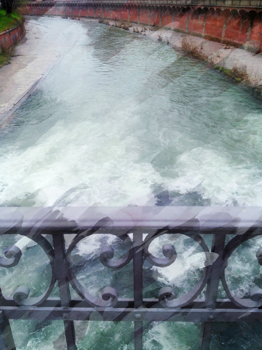
Repix offers lots of photograph editing options but its strong point is that it allows you to apply brush strokes in many different pictorial styles to one image, from tempera to charcoal, oil or line drawings; it allows you to apply the effect by “painting” it onto the image. This gives you more room for creativity but does require a bit of practice to get it right.
This photo of the River Dora in Turin was developed using the Van Gogh style, my favourite.

As you can guess by the name, Waterlogue transforms your images into amazing watercolours; there are 12 different styles from which to choose and you can adjust the fineness of the brush stroke.
This backlit picture of the Duomo in Milan was edited using Vibrant style.
Suggestions for pictorial editing
With these and many other apps that enable you to perform pictorial editing, it may become almost automatic to create digital paintings, but you can risk ending up with photos that are a bit stereotyped.
Here are some suggestions for achieving good results:
- Experiment with various apps and styles on the starting image to find the best pictorial editing for the effect you want to obtain; with time, you will learn to understand which is the right app right from the click of the shutter.
- Try using more than one app on the same image, making use of the functions of each one that are best adapted to your style; develop personal image editing workflows, linking several effects.
- When you want to highlight a subject in a photo, apply the editing selectively and not to the whole image; the contrast effect creates a more effective and striking image.
- For all apps that let you “paint” on the image, it can be useful to use a capacitive stylus (available in electronics stores) that gives you more precision than using a finger.
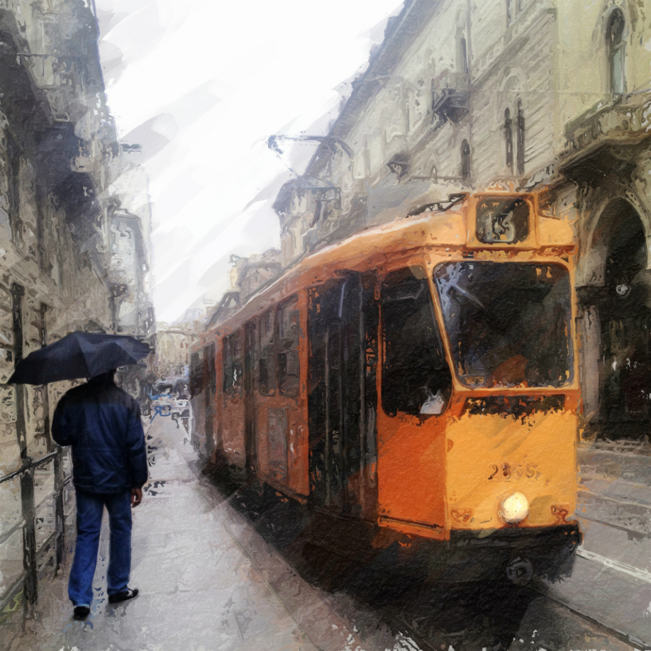
This final photo is a good example of following these suggestions:
- I made adjustments to the original photo using Snapseed to increase the brightness and contrast.
- I applied a personalised style using Glaze, which I had created previously.
- Using Repix, I applied Van Gogh style in diagonal brush strokes, to reproduce the rain that was falling at the time I took the shot.
- I selectively avoided applying steps two and three to the subject with the umbrella, to make him stand out in the photo, creating an almost 3D effect.
I hope that this article helps you in your pictorial creations, transforming your photos into age-old canvases or delicate watercolours. But, above all, I hope that you have fun using creative editing.
Davide Capponi
Davide Capponi is a photographer who is passionate about mobile photography and photo editing. His works have been exhibited in Italy and abroad and published in Italian newspapers and magazines. He is a founding member of the New Era Museum, neweramuseum.org. You can get in contact with David via his blog davidecapponi.com, on Instagram instagram.com/rubicorno, on Facebook www.facebook.com/davidecapponi.iphoneography and on Twitter twitter.com/Rubicorno.